When Nintendo of America's president calls unexpectedly, you don't question it - you pick up immediately.
That was the advice designer Chris Maple received from a colleague in 1998 when warned about an impending call. As owner of Media Design, a Seattle-based firm specializing in rapid turnaround design solutions, Maple was accustomed to urgent requests from major corporations like Boeing, the Seattle Mariners, and Holland America Line - though these contributions often went uncredited.
When Minoru Arakawa's secretary summoned Maple to Nintendo's Redmond headquarters regarding a new game project, he had no idea he was about to shape the visual identity of what would become Pokémon. "I sat staring at this magnificent crystal horse head display in their lobby for thirty minutes," Maple recalls. "You develop an instinct for reading corporate environments when you're constantly solving visual problems under pressure."
The Birth of a Global Icon
In that pivotal meeting, Arakawa presented Maple with prototypes, concept art, and toy figures. "They dumped this collection of strange creatures and drawings on the table and told me, 'It's called Pocket Monster - we're rebranding it as Pokémon,'" Maple explains. The challenge? Design the franchise's iconic logo in just one month for its western debut.
Without gameplay access or substantial background, Maple worked tirelessly on a light table creating dozens of iterations. "The logo needed to work in pixelated Game Boy resolution while maintaining its essence in black-and-white," he notes. After presenting multiple options, Nintendo executives immediately recognized the now-familiar yellow-and-blue design as the winner.
Color Theory and Instinct
Maple attributes the logo's success to intangible factors: "It had the right energy and storytelling potential." While the color scheme aligned with the upcoming Blue and Yellow game versions, Maple insists the choice was instinctual. "It simply felt right - I know that sounds artistic, but that's how design works at this level."

From Obscurity to Global Recognition
The logo's public debut came via Nintendo Power magazine before reaching its full cultural impact. "Walking into Toys R Us months later and seeing massive Pokémon displays with my logo everywhere was surreal," Maple recalls. Later minor adjustments to the "P" and "E" characters refined the design into its final form.
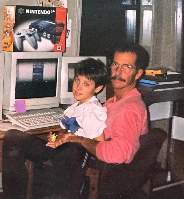
Though Maple contributed to other Nintendo projects including Ken Griffey Jr. baseball titles and N64 packaging redesigns, his anonymity surrounding the Pokémon work lasted decades. "Industry norms prevented me from claiming credit initially," he explains. "It took my son encouraging me 27 years later to finally document this achievement."
A Designer's Legacy
As Pokémon approaches its 30th anniversary, Maple hopes for reconsideration of the logo's original 1998 version. "There's an energy and structure to that initial design that new commemorative elements must respect," he advises. He's now teaching design to underprivileged youth, where the revelation of his Pokémon connection creates excitement.
"Watching generations embrace something I created is profoundly rewarding," Maple reflects. "Those classroom moments when kids light up realizing I designed their favorite game's logo? That's the real magic."