Is Civilization VII's UI as Bad as Advertised? A Critical Examination

Civilization VII's Deluxe Edition launched recently, and online discussions are buzzing about its user interface (UI) and other perceived flaws. This article delves into the game's UI, analyzing whether the criticism is justified. We'll dissect its components and evaluate whether it meets the standards of a functional 4X game interface.
← Return to Sid Meier's Civilization VII main article
Assessing Civ 7's UI: Is the Hype Real?
The early release of Civ VII (Deluxe and Founder's Editions) has drawn considerable criticism, particularly regarding its UI and missing quality-of-life features. While it's easy to join the chorus of complaints, a more measured approach is needed. Let's examine the UI element by element, comparing it to established best practices for 4X game interfaces.
Defining a Superior 4X UI
While some argue for objective standards in 4X UI design, the reality is more nuanced. A game's context, style, and goals influence UI design, demanding case-by-case evaluation. However, common elements consistently appear in successful 4X UIs. Let's use these elements as benchmarks for Civ VII.
We'll evaluate Civ VII's UI based on key aspects of effective 4X UI design:
Information Hierarchy Clarity
A clear information hierarchy prioritizes accessibility and relevance. Frequently used resources and mechanics should be prominent, while less crucial features remain easily accessible. The UI shouldn't display everything simultaneously but should organize information logically.
Against the Storm's building info menus exemplify this. Right-clicking a building reveals a multi-tabbed menu, prioritizing common actions (worker assignment, production) in the primary tab and relegating less frequent actions to subsequent tabs.
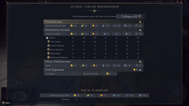
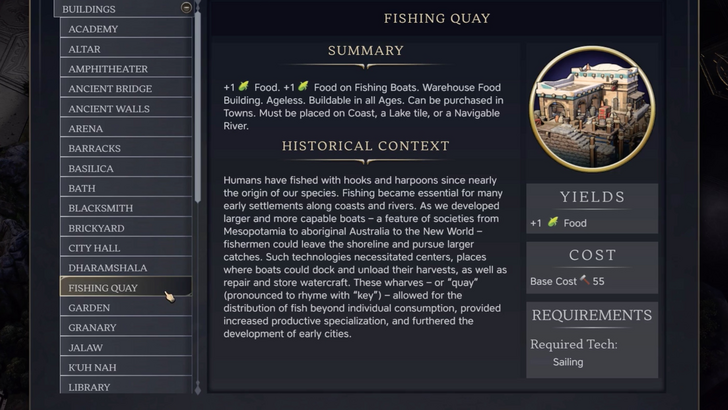
Civ VII's resource summary menu presents resource allocation across the empire, separating income, yields, and expenses. While well-structured and collapsible, it lacks granular detail. It shows resource origins from Rural Districts but not specific districts or hexes. Expense breakdowns are also limited. The UI functions adequately but could benefit from increased specificity.
Effective Visual Indicators
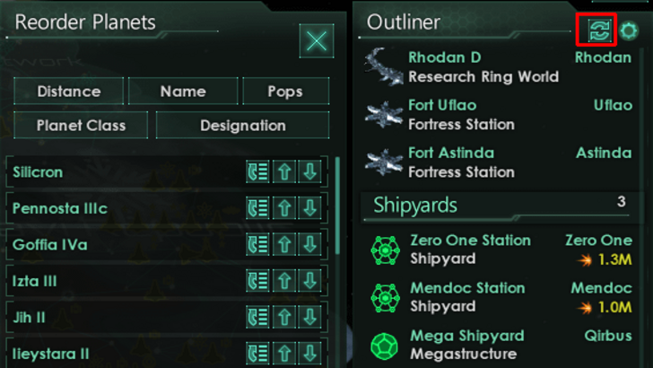
Effective visual indicators (icons, colors, overlays) convey information quickly without relying on text. Stellaris's Outliner, despite overall UI criticisms, uses visual indicators effectively, instantly showing ship status and colony needs.
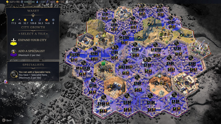
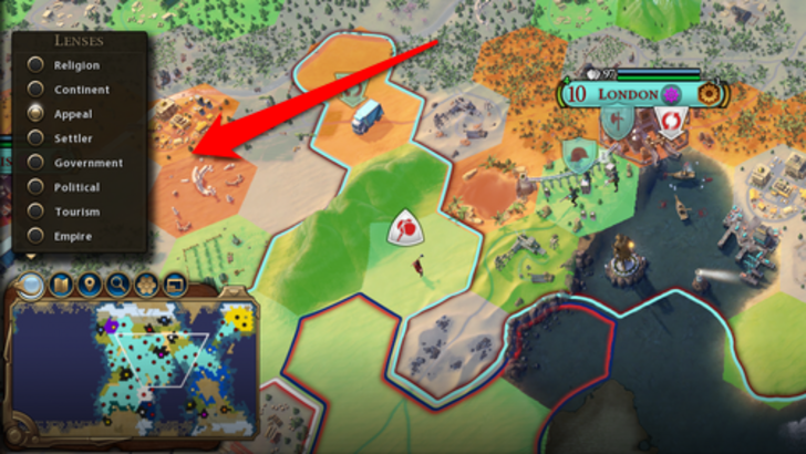
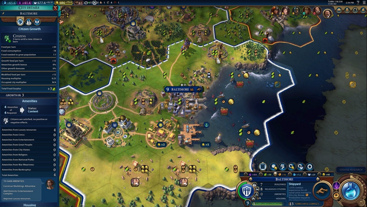
Civ VII employs iconography and numerical data. Tile yield overlays, settlement overlays, and settlement expansion screens are effective. However, the absence of certain lenses present in Civ VI (appeal, tourism, loyalty) and customizable map pins is a significant drawback. While not disastrous, improvement is needed.
Search, Filtering, and Sorting
Search, filtering, and sorting are crucial for managing information overload. Civ VI's robust search function allows players to locate resources, units, and features easily. Its Civilopedia seamlessly links entries to in-game elements.
Civ VII lacks this search functionality, a major usability issue given the game's scale. This absence significantly impacts navigation. The lack of a comparable Civilopedia integration further exacerbates this problem.
Design and Visual Consistency
The UI's aesthetic and cohesiveness are crucial. Civ VI's dynamic, cartographic style seamlessly integrates with its overall aesthetic, reinforcing the game's identity.
Civ VII adopts a minimalist, sleek design. The color palette (black and gold) is sophisticated but less visually striking than Civ VI. While not inherently bad, its subtler thematic direction may not resonate with all players. Visual design is subjective, but the lack of immediate clarity has contributed to mixed reactions.
The Verdict: Not as Bad as Claimed
Civ VII's UI, while not perfect, isn't as disastrous as some claim. The lack of a search function is a significant flaw, but not game-breaking. Compared to other issues, it's relatively minor. While it falls short of other visually impressive 4X UIs, it possesses strengths. With updates and player feedback, it can improve. Currently, it's not as bad as the widespread criticism suggests.
← Return to Sid Meier's Civilization VII main article
Sid Meier's Civilization VII Similar Games